Art of Instruction
Conceptual artist, John Baldessari, is known for his influential style, in which he has produced photographs, sculptures, films and billboards incorporating his innovative ideas. I am intrigued by the work of John Baldessari, not only because of his engaging use of colour that I have noticed in much of his art, but also because of the sort of freedom that I feel his work represents. Baldessari does not confine himself to one subject matter or technique, and seems to continuously questions the conventions of photography and overall what defines a photograph. In my view, I believe Baldessari almost uses photography as a tool to investigate varied ideas and concepts. As a result of this approach to art, I believe the almost overwhelming interest Baldessari has for photography is clear in his work, therefore creating absorbing, exciting images for an audience.
Baldessari involves written text in many of his images, including 'Wrong, 1967' and 'Some other way, 2015'. His interest in visual language is specifically displayed in his work on instructions. Baldessari, a teacher at the time, set his students the task of following specific instructions in order to capture images. We as a class also explored this same idea. Each class member wrote five specific instructions for five different images on a sheet of paper, before randomly distributing these sheets to one another.
Initially, when I first approached this task I found myself feeling almost limited in taking my photographs. The idea of instructions to me signifies restrictions and a lack of freedom - things I perceive as opposite to Baldessari's work. However, the more I considered and actually took part in the task, I realise that perhaps these instructions or 'limitations' make room for more creativity. I believe the limit on our freedom of choice for what we include in the photograph encourages us to perhaps consider our photography more closely, as we may be thinking about the images we are capturing more in order to make it fit with the instructions given. As a result of this close consideration in order to display our given instructions accurately in our images, perhaps we are influenced to take better pictures, and to use the seemingly little creative freedom we have to our advantage. Upon further reflection, perhaps Baldessari had the same reasoning for 'instructing' students to photograph using a list.
My response to instructions
The five instructions I received:
- Photograph someone in a corner shop
- Take a photo of someone with coloured light on their face
- Take a full body shot on a bridge in London
- Take a photo with only half their face in shot
- Take a photo of somebody wearing all the same colours


After capturing my images, I asked the student who gave me the instructions for feedback. He told me that he liked the photographs and they all, to a large extent, fit the expectations he had when writing the instructions. However, he did say that in the fourth photograph (instruction four) he imagined that I would take a photograph of somebodies full face and use an editing application to crop half of the face out, instead of just instructing my model to turn to the side.
Overall, I found the task somewhat challenging. Although a lot of the instructions were fairly simple to take, for instance someone in a corner shop, or half of somebodies face, others I found took more effort to capture. For example, when I initially read the instruction of photographing someone with coloured light on their face I wondered how I would produce this image. However, I found that placing a coloured plastic sheet in front of the torch of my phone resulted in a coloured hue on my models face. This was an aspect of the task that I enjoyed, as, not only did I find a new technique that I can utilise in other photographs, but I found that the instructions I received caused me to take images of a variety of subject matters, and therefore encouraged me to move away from the pictures I usually take.
Overall, I found the task somewhat challenging. Although a lot of the instructions were fairly simple to take, for instance someone in a corner shop, or half of somebodies face, others I found took more effort to capture. For example, when I initially read the instruction of photographing someone with coloured light on their face I wondered how I would produce this image. However, I found that placing a coloured plastic sheet in front of the torch of my phone resulted in a coloured hue on my models face. This was an aspect of the task that I enjoyed, as, not only did I find a new technique that I can utilise in other photographs, but I found that the instructions I received caused me to take images of a variety of subject matters, and therefore encouraged me to move away from the pictures I usually take.
Instructions collage
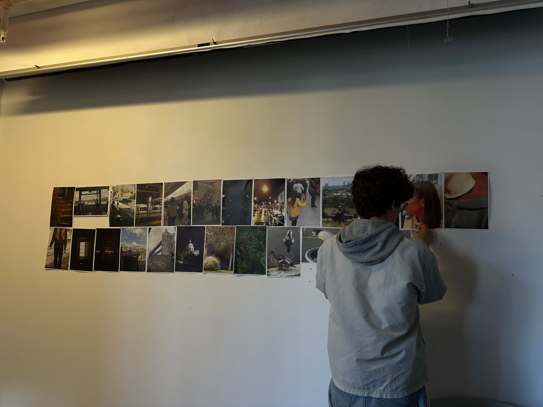
In todays lesson, each student printed out their pictures based on instructions, and, as a class, we gathered them into a collage. There was no careful thought process behind the arrangement of the images, but looking at all of the images adjacent to one another encouraged me to notice the relationships and connections between specific images.

|
From this brief consideration of the parallels and connections between our photographs we, as a group, took some time to edit the original collage in order to create a more thoughtful arrangement. We had to make a number of decisions, for instance, there were a few images that we had to remove due to them perhaps not fitting with the sequences or relationships between the images we had identified as a class. Every photograph almost had to have a reason to be in the collage, whether that be due to it making sense in the sequence we had decided on, or giving us more evidence towards our main point / narrative we wanted to portray in the images.
I enjoyed the collaborative aspect of this task as the majority of the work I do is independent. There were a number of decisions we had to make in order to get to the final result, and consequently much group discussion. I actually really valued our conversation, as I found it interesting to hear other peoples ideas and interpretations of things that I wouldn't have initially picked up on if I had been doing independent work. |
|
Final collage

Our end result aimed to represent a journey, beginning on public transport (a photograph of a bus and train station) and ending with a photograph of a tree, perhaps, as nature is often associated with calm and tranquility, representing a peaceful end to the day. The photograph at the beginning of the sequence and the end of the sequence, in my opinion, invite a viewer to perhaps explore the relationship between these two images, as the beginning and end are significant moments in a series. Though these images of course contrast one another, I also think they provide a similar start and end to the sequence. The pictured bus is empty, which to me has associations with a calming bus ride; a relaxing journey where the traveller is able to sit calmly and watch the landscape outside. As I mentioned earlier, the final photograph also has similar effects, connoting with feelings of serenity, with stillness. I believe perhaps these symbols of possible rest and calmness function to further enhance the more, almost hectic, day that the images in between aim to represent.
Overall, I was satisfied with the final result. Being a collaborative project, it is difficult to please everyone, however I think the straightforward main idea of somebodies day perhaps creates a clear narrative, which is a simple base that allowed us to build on as a class. Moreover, I think the individual photography styles and opposing subject matters photographed enhance the collaborative nature of the task, and perhaps make this collective effort more clear to a viewer. Additionally, I think it was useful that so many of our images were used, as it gave us a lot of options, and therefore, in my opinion, resulted in a perhaps quite compelling final result due to the versatility of the images.
Overall, I was satisfied with the final result. Being a collaborative project, it is difficult to please everyone, however I think the straightforward main idea of somebodies day perhaps creates a clear narrative, which is a simple base that allowed us to build on as a class. Moreover, I think the individual photography styles and opposing subject matters photographed enhance the collaborative nature of the task, and perhaps make this collective effort more clear to a viewer. Additionally, I think it was useful that so many of our images were used, as it gave us a lot of options, and therefore, in my opinion, resulted in a perhaps quite compelling final result due to the versatility of the images.
Georgia O'Keeffe and Alfred Stieglitz
Stieglitz, an already well established figure in the New York art scene at the time, met Georgia O'Keeffee when she was twenty nine, and recently finished with her education as an art student. Stieglitz was the creator and manager of a well known, New York City art gallery, 291, and after Steiglitz received and exhibited a series of O'keeffes paintings, the pair connected, O'keeffe becoming Stieglitz' muse and the couple capturing hundreds of photographs in collaboration.


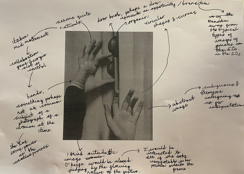
The theme of O'Keeffes' hands appears very prevalent throughout their collaboration. In many of the images, O'Keefes hands seem to be placed in a way that seems natural, almost as though she is exploring her surroundings, or even swaying her hands around gently. This subject matter could give us an insight into the power dynamic between O'Keeffe and Stieglitz. Many of these photographs were taken in the 1920s, a period of patriarchy, where often a man would've been the authoritarian. Therefore, I don't think it is absurd to say that is may likely that Stieglitz and O'Keeffe had an unbalanced dynamic, with Stieglitz perhaps controlling the actions of his muse.
However, at the same time, the photographs from their collaboration to me, in a time of deep patriarchy, seem to meanwhile represent a sense of freedom, a transition regarding the roles of women. In fact, a part of me believes that maybe Georgia possessed much of the control in this collaboration. This idea is enhanced by, firstly, the subject matter. Hands aren't necessarily a symbol of objectification, which differentiates from the typical photographs of women around this time, therefore alluding to a woman as well as a mans input into the content being photographed, and enhancing the feeling of collaboration I associate with these images. Moreover, the flowing, relaxed nature that O'Keeffes' hands seem to be moving in doesn't seem posed, and almost, in my view, depict the idea of O'Keeffe just moving her hands as she pleases, and Alfred capturing almost action shots of these motions. This indicates that perhaps O'Keeffe had a lot of control in the creative process, differentiating from the norms of the time.
However, at the same time, the photographs from their collaboration to me, in a time of deep patriarchy, seem to meanwhile represent a sense of freedom, a transition regarding the roles of women. In fact, a part of me believes that maybe Georgia possessed much of the control in this collaboration. This idea is enhanced by, firstly, the subject matter. Hands aren't necessarily a symbol of objectification, which differentiates from the typical photographs of women around this time, therefore alluding to a woman as well as a mans input into the content being photographed, and enhancing the feeling of collaboration I associate with these images. Moreover, the flowing, relaxed nature that O'Keeffes' hands seem to be moving in doesn't seem posed, and almost, in my view, depict the idea of O'Keeffe just moving her hands as she pleases, and Alfred capturing almost action shots of these motions. This indicates that perhaps O'Keeffe had a lot of control in the creative process, differentiating from the norms of the time.
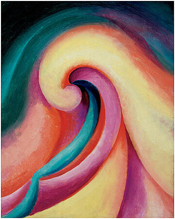
Georgia O'Keeffe, Series I - No.3
|
The images incorporate many curved, organic shapes, an aspect that I like and believe reflects an almost relaxed atmosphere, with the lack of sharp, angular shapes, which conversely, in my view, portray an element of tension. These organic shapes actually remind me of the work of O'Keeffe and are reminiscent of the soft, curved forms incorporated in much of her work. This idea further enhances the element of collaboration present in Stieglitz and O'Keeffe's partnership, as perhaps Steiglitz took inspiration from the curvilinear elements of Georgias paintings for his own photographs. |
Broomberg and Chanarin
Broomberg and Chanarin, a pair of artists living in London, work together to produce thought provoking and engaging art. Their work differs from more conventional art work, possessing experimental and unfamiliar qualities that encourage me, as a viewer, to carefully consider their work in more detail. Broomberg and Chanarin describe the act of their creative process together as like, "thinking with one brain", and, "seeing with one vision", Perhaps this insight into their dynamic explains why their work seems is, in my view, so considered and thoughtful. Broomberg and Chanarin have many projects where they experiment with varying techniques and processes, showing their versatility as artists.
|
|
|
'Scarti' - Broomberg and Chanarin
'Scarti', a photo book by Broomberg and Chanarin, consists of various images originally taken from Ghetto, one of their books from 2003. Ghetto consists of a documentation of twelve gated communities, for example locations such as a Californian retirement home, an old peoples holiday camp in the USA, a high security South African prison and a psychiatric hospital in Cuba. However, the images from Ghetto do not remain the same as in their appearance over ten years ago, and instead they have been altered.
During the printing of Ghetto a by-product called "Scarti di avviamento" was produced as a result of the paper that is used to clean drms of ink between print runs. This by-product is typically destroyed once the book is printed, however the 'scarti' or scraps of these images were stored, and later rediscovered by Broomberg and Chanarin. They took to the overlapping and layering of the "Ghetto" photographs that this printing had caused, and therefore display these images in their Photobook 'Scarti'.
This accidental printing mistake in my view reveals something beautiful, however. The contextual juxtapositions combined with the overlapped contrasting subject matters create unique images. In my opinion, these photos are almost suspended on the line between reality and fantasy - the spaces in the images, and the people photographed are very much real, however the uniting of various documentations of different gated communities, in my opinion, evokes this sense of something unreal. These images, combining the photographs of completely different people from completely different communities, represent something that would likely be impossible to find in reality. Consequently, I believe this aspect further increases feelings of intrigue and captivation when I see the work of Broomberg and Chanarin. In my view, much of their work is not a depiction of reality, evoking a sense of the uncanny - on the edge of familiarity, but possessing an overwhelming sense of unfamiliarity too.
Subsequently, their work, especially this 'Scarti' series, with Broomberg and Chanarin's arguable portrayal of reality, of fantasy and of this consequential feeling of the uncanny to me is very absorbing, not only due to its beauty, but due to, as it is close to reality but also somewhat 'off' at the same time, the fact it makes me want to ponder on the image, in order to further understand what it is I am seeing.


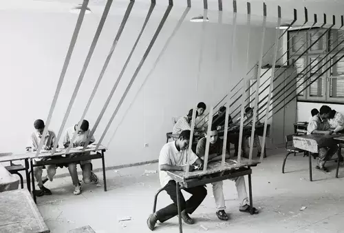
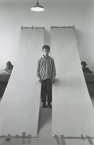
Hicham Benohoud - La Salle de Clase
|
While working as an art teacher in a Marrakech school Benohoud incorporated both the classroom and photography, utilising students and ordinary classroom props to create photographs of a performative genre. He named this series, 'La Salle de Clase', meaning classroom.
Through these images, Benohoud creates a juxtaposition between childish games and symbols of violence, as the models remain sometimes restricted or limited by the props that hang from their arms or wrap around their bodies. Moreover, I would say that many of the images perhaps possess an idea of entrapment, for instance in one image a hula hoop - a seemingly playful symbol - is held in front of the camera, making it look like the model who sits in the centre of the photograph is surrounded by this hoop. It's almost as if Benohoud takes these objects, of which are typically associated with the classroom, and therefore perhaps safety and play, and alters their meaning, giving them more negative connotations of restrictions and feelings of confinement. Moreover this idea of confinement is further enhanced through the setting the images are captured in, specifically the lack of windows (often a representation of freedom). I also believe the act of collaboration is clear throughout each image. In many of the photographs you can see the students working intently in the background, perhaps a visual representation of the concentration and discipline they used during the exercise, as well as the mutual respect the students had for the task and one another. |


Response to La Salle de Clase
Using props found around the classroom, in response to the work of Benohoud, I took my own performative photographs.
My main aim for my photoshoot was just to experiment and explore the aspect of performance in photography. I don't often take photographs utilising props and a model, so I mainly just wanted to explore this aspect of photography and, therefore refrained from setting myself any rules.
My main aim for my photoshoot was just to experiment and explore the aspect of performance in photography. I don't often take photographs utilising props and a model, so I mainly just wanted to explore this aspect of photography and, therefore refrained from setting myself any rules.


In my first three images displayed above, I investigated the effects of coloured light in photography. I held a piece of coloured transparency in front of bright lights, and then instructed my model to stand in front of a white background, in order to further enhance the colour of the lights. I especially like the effect this technique created in my first image - a hue of purple and green on the model and backdrop.
On the other hand however, I was disappointed with a few of my photographs. If I were to do the task again, I would ensure that I perhaps focused on smaller details. For instance, considering some of images I feel that I could’ve payed closer attention to the back ground. In some photographs there are people, or objects in the background obstructing part of the picture, which takes the attention away from the model and therefore central focus of the photograph.
Overall, I feel I need more practice in the style of performance photography as I felt that in the task I lacked ideas, and felt out of my comfort zone. Although this is not always a bad thing, in this case I feel my lack of practice regarding this style of photography was apparent in my images, which are not particularly individual or innovative, unlike the work of Hicham Benohoud.
Broomberg and Chanarin response: Fictional character task
In class, each person wrote a description of a fictional character with an interest in photography. In our description, we listen different aspects of our individuals identity, such as their name, insights into their life, their photography practice, and perhaps even personal details regarding their upbringing, where they live, where they studied etc. I found this element of the task enjoyable. It is not often that I create my own fictional characters, so this task almost came with a sense of freedom. There were no limits as to the character I constructed, so I found pleasure in the lack of restrictions, and the element of fiction that allowed me to use my imagination and encouraged me to detach from reality for a while.
Each character description was then distributed randomly to each of us. After reading the unfamiliar depiction, our task was then explained: we had to inhabit the persona of the person we were given, and take photographs in the style of these fictional individuals.
This task was inspired by Broomberg and Chanarin. The collaborative nature of the two artists process works effectively, resulting in innovative, intriguing work. They describe their creative process as like, "thinking with one brain", and "seeing with one vision,", further enhancing the effectiveness and seamless quality of their collaboration that is, in my opinion, apparent in their individual, compelling work. Inspired by the collaborative quality of their art, we therefore incorporated this trait into our project. Perhaps without even recognising it, collaboration was vital for this task to work. For instance, I believe it was necessary for another student to write the fictional brief, because the random generation allowed me to possibly become more absorbed in the character, as, unlike if I had written my own fictional brief, I was able to detach from the thought process behind the creation of the character. Instead, I feel as if I could immediately inhibit the character, as another student had designed the fictional person, therefore eliminating an element of control, and perhaps allowing me to properly commit to the brief. Without this aspect of collaboration, and if I had completed the brief and consequently the whole task by myself, I feel an element of the freedom I think came with the task would perhaps be stripped, as I would maybe focus more on the fact I wrote the brief myself and perceive the task through my own eyes, rather than incorporating someone else's ideas, and therefore taking my photographs from the point of view of a fictional character.
Description I was given

The final images


I like my final images in some ways, but I am unhappy with other aspects. For example, unfortunately my images do not stay completely true to the brief I was given. My brief states that my character captured her images using a film camera, however I did not use a film camera to take my images, and instead photographed with a digital camera. I made this decision because the film camera I have at home does not have the ability to zoom, and due to the subject matter of my images being planes in the sky, I thought it was necessary that I used a camera with a good zoom, in order to capture clearer images. I feel, though this decision in my view allowed me to take perhaps better images from an aesthetic viewpoint, from an accuracy point of view this decision does not achieve the initial intention. If I were to recreate this experiment, I would try to find a way around this problem, and perhaps even just try using a film camera to at least see how the result would look, instead of dismissing it almost immediately.
However, I did try to make my images appear as though they were photographed on a traditional film camera by applying filters to my images. I played around with the grey scale for each image, and therefore some photographs possess a slightly different combination of black and white to others.
Overall, despite some inaccuracies, I am happy with my images. I think the black and white perhaps adds a dramatic quality to my photographs, especially the images which display a more drastic contrast between the dark sky and the clouds, which I like. Additionally, the majority of photographs I take focus on things on the ground, so therefore the fact I was forced to take pictures of the sky allowed me to perhaps get out of my comfort zone a bit, and experiment with a different subject matter which, without this task, perhaps I would have never incorporated in my photographs. Therefore I believe this was a very positive task as not only did it give me the opportunity to try something new, but it also encouraged me to reflect on the concept of collaboration in photography, and the various forms this can take depending on the work being produced, or task being completed.
Photography and feelings
We began todays task by writing a paragraph about how we were feeling. I included a series of different feelings in my paragraph, discussing how despite feeling tired and perhaps somewhat miserable due to the rain, there were still positives to my day, such as my dad driving me to school, and looking forward to seeing my friends and relaxing at home later.
I then made an attempt to translate these elements of my mood into photographs, trying to capture specific atmospheres and symbols that I felt perhaps reflected aspects of my paragraph.
I then made an attempt to translate these elements of my mood into photographs, trying to capture specific atmospheres and symbols that I felt perhaps reflected aspects of my paragraph.


Overall, I found the task quite difficult. I feel that taking photographs outside felt more challenging in the rain. Moreover, though the mundane weather perhaps helped to reflect the feelings mentioned in my description, I think the lack of noticeable light it created made it more difficult for me to create a variety of interesting images. I also feel that perhaps I was trying to make my photographs too literal. For example, I feel I was limiting myself as I somewhat failed to recognise that photographs can capture a specific tone without you having to include the explicit subject matter that is an obvious representation of the idea / feeling you are trying to portray. Therefore, I feel perhaps my photographs are too obvious, and consequently do not leave much room for interpretation.
If I were to repeat this task, I would perhaps focus less on portraying an obvious message in my images, and instead realise that often successful images do not display their ‘answers’ immediately on first glance. On the other hand, perhaps an intriguing image is something that forces you to consider what it is trying to display, and encourages thought and deliberation. Therefore, next time I will concentrate less on making the emotions in the images completely obvious to a viewer, and therefore hopefully give myself more creative freedom. Hopefully this will then create photographs that require more careful consideration to uncover the ideas I hope to portray in my photographs, consequently producing something more thought provoking and intriguing.
If I were to repeat this task, I would perhaps focus less on portraying an obvious message in my images, and instead realise that often successful images do not display their ‘answers’ immediately on first glance. On the other hand, perhaps an intriguing image is something that forces you to consider what it is trying to display, and encourages thought and deliberation. Therefore, next time I will concentrate less on making the emotions in the images completely obvious to a viewer, and therefore hopefully give myself more creative freedom. Hopefully this will then create photographs that require more careful consideration to uncover the ideas I hope to portray in my photographs, consequently producing something more thought provoking and intriguing.
Photography regarding feelings - experiment 2


Dream like photographs
|
|
I began this task by looking through books which I believe evoke a dream like feeling. I took inspiration from Gregory Halpern's 'Let the sun beheaded be', Martina Hoagland Ivan's, 'Far Too Close', and the work of Dirk Braeckman. I feel, though these books differ, they all evoke a similar feeling of which I associate with dreams. The under exposure featured in the images of Far Too Close suggest a sense of mystery, and this sentiment is further enhanced by the vagueness of the images. Photographs of people with obscured faces, and therefore identities create a further mysterious element of which is reminiscent of that of dreams, as often in dreams peoples identities are not completely obvious. Whilst the pictures are taken in various locations, the underexposure present throughout links them, and creates an overall impression of a mysterious, dream like state.
|


|
In common with dreams, elements within these books may not be as straight afford as they first appear. I find myself questioning what the photographs in the books represent, in common with the way in which everything may not appear to be as it seems in a dream, and sometimes dream motifs function to represent something seemingly unrelated. Without clear cut meaning of the photos, we are forced to consider tiny details that previously we may not have noticed. Without context, we are forced to consider the meaning behind the images. For instance, Dirk Braeckman's photographs focus on the familiar, things that are immediately recognisable, and this in turn encourages a viewer to perhaps more carefully consider why these photographs display what they do. We are not given obvious answers, a concept reminiscent in the ambiguity our dreams may possess.
On the other hand, Gregory Halpern's subject matters seem less familiar to me, but equally intriguing, creating this dream state. I found some of his photographs, though interesting, quite unsettling. Perhaps this is what makes me associate them with dreams, as often the idea of dreaming is an unsettling concept, and something the average person perhaps does not know much about. In Halpern's book, some very beautiful images are then followed by some rather unnerving ones, similarly in dreams sometimes you are exposed to more unnerving things without warning. The exposure to these images without warning is what perhaps makes dreams unnerving, as we have no control over what we are going to see next. Therefore, I think Halpern's photographs in 'Let the sun beheaded be' share many of the same qualities I associate with dreaming. |

Dirk Braeckman

Dirk Braeckman
|


I tried to capture this essence of mystery in my images. Their meaning is ambiguous, but there are recurring elements in each photographs which link them, perhaps in the same way dreams often feel very random, but upon further consideration you can notice links between series’ of dreams, or dreams and your everyday life.
My response


|
Taking inspiration from Martina Hoagland Ivan, I under exposed my photographs in the hopes to surround my images with an atmosphere of mystery, perhaps in turn associating my photographs with an eerie feeling. I also drew upon threshold concept #2 (photography is the capturing of light ; a camera is optional). When taking my photographs, especially influenced by Gregory Halpern and and his beautiful capturing of light to create almost poetic portraits, I focused on the way the light fell on the subject matters, and how it functioned to enhance the dream like quality of my pictures. I also tried to capture smaller details like I have noticed in Braeckham’s photographs, in attempts to encourage viewers to more carefully consider what my photographs were trying to achieve.
Overall I like my outcome. Though the series of images do not portray a coherent narrative, I do not mind this, as often dreams do not make sense, and require thought in order to understand why we are being shown a series of dreams. |

|
Exploring model making: Thomas Demand
“Models provide us with a focus on our world, as its complexity would place an inconceivable load on our apprehension without such filter.” –Thomas Demand
I noticed that my fictional character task perhaps encouraged me to take photographs of something different, consequently allowing me to get out of my comfort zone more and focus on something that, without this task, I wouldn't typically consider taking photos of. For this reason, I thought this was a good task, and trying something different was probably a useful exercise for me. Therefore, I decided to research an artist who's work is not typical of anything I have ever done before, of whom I will then respond to. Moreover, the kind of fictional world depicted in my dream like photographs mirror the kind of imagined spaces Demand creates.
I have decided on Thomas Demand. Prior to more detailed research, I knew very little about Demand, only really being aware of the fact the contents of his images are not "real" settings but, instead fabrications created through the use of paper and cardboard sculptures. However, this truth was enough to impress and interest me enough to be eager to learn more and familiarise myself with his process. I found out that his photographs are politically charged, and he recreates locations or areas that represent significant historical events. For example, a sculpture of a bathroom containing the corner of a bath alludes to a 1987 photo of Uwe Barschel, a German Politician, who was found dead in a hotel bath. Other examples include a kitchen representing where Saddam Huessein cooked his last meal before he was captured in 2003, or the creation of conference room, a depiction of a location where a failed assassination attempt on Hitler took place in 1944. When questioned about why he began reconstructing these events, Demand discusses how there are certain events that are perhaps supposed to have, "an educational impact on us," and he mentions how he thought, "What if I actually visit this, rebuild my own version of it so I can be there and have a look at it,". I interpret from this that perhaps his work initially functioned as a means of understanding events further. In making these reconstructions he can explore, not only due to further consideration, but also physically explore a place or event that he doesn't have access to.
I have decided on Thomas Demand. Prior to more detailed research, I knew very little about Demand, only really being aware of the fact the contents of his images are not "real" settings but, instead fabrications created through the use of paper and cardboard sculptures. However, this truth was enough to impress and interest me enough to be eager to learn more and familiarise myself with his process. I found out that his photographs are politically charged, and he recreates locations or areas that represent significant historical events. For example, a sculpture of a bathroom containing the corner of a bath alludes to a 1987 photo of Uwe Barschel, a German Politician, who was found dead in a hotel bath. Other examples include a kitchen representing where Saddam Huessein cooked his last meal before he was captured in 2003, or the creation of conference room, a depiction of a location where a failed assassination attempt on Hitler took place in 1944. When questioned about why he began reconstructing these events, Demand discusses how there are certain events that are perhaps supposed to have, "an educational impact on us," and he mentions how he thought, "What if I actually visit this, rebuild my own version of it so I can be there and have a look at it,". I interpret from this that perhaps his work initially functioned as a means of understanding events further. In making these reconstructions he can explore, not only due to further consideration, but also physically explore a place or event that he doesn't have access to.


Demands work alone, even without knowing the significance of it and its correlation to history, is impressive. His work seems suspended on the line between reality and the artificial. Reality seems to be evoked due to the meticulous detail of the sculptures, as well as Demands use of colour, which really interests me, due to the bright block quality of the colours. The sculptures are clearly well made, and his skill is apparent even when just observing how realistic and detailed the images are despite being made from cardboard and paper, let alone the significance behind them. The politically charged aspect of the images add a whole new element, evoking more intrigue. When I look at the photographs of Thomas Demand, I am encouraged to question the inspiration for the images, and perhaps why he chose to capture this specific moment in history.


Tom Hunter
|
Another artist who has utilised model making in their work is Tom Hunter. A project of Toms, The Ghetto, is a replica model of three streets in Hackney, London, where Tom Hunter lived as part of a growing squatting community in the 1980s and 1990s.
In 1994, the area this model encapsulates began to be threatened with demolishment, and the squatters were threatened with eviction by the Hackney Council. This therefore encouraged Hunter to create an exact replica of these places: Ellington road, London Lane and Mare Street. In a discussion about his work, he explains that the idea was to create a documentation of the area, "before it was bulldozed," stating that he wanted to, "represent everyone’s houses before they were all destroyed so that in generations to come they could see what was there.” Thomas Hunters sculpture gained some publicity, making headlines and encouraging the council to directly speak with the community that this area meant a lot too. Eventually, coming to the decision to find a way to, "save and regenerate the area,".   |
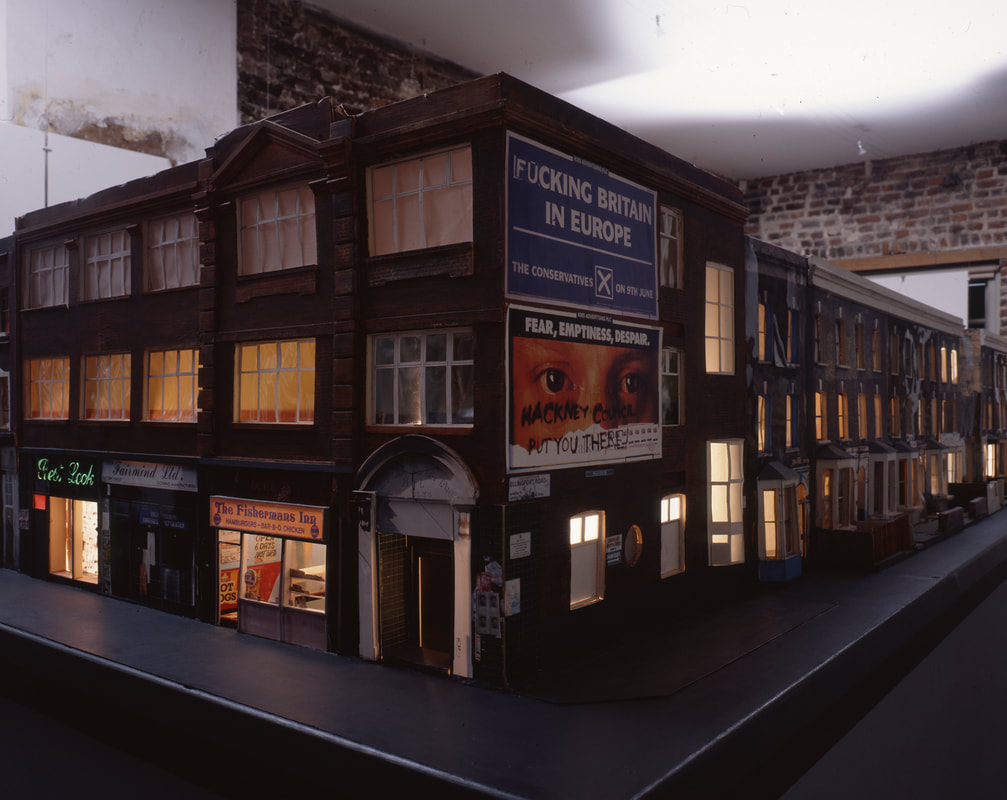
Toms created these streets using transparencies, wood. cardboard and photographs, paying attention to very small details to create the impressively realistic model. I really like how much detail Hunter included in the sculpture, and though I have never been to the exact streets I feel, through his use of small features like lit up rooms displaying people drinking tea, and graffiti sprawled across posters on the exterior of houses, he has really captured the atmosphere or essence of the area.
The streets likely look very different now, but Hunter has managed to keep an accurate documentation of a specific moment in time, which will remain for years into the future, despite the ever-changing location. |


Beginning my response
To respond to the work of both Thomas Demand and Tom Hunter, I think I am going to create my own sculpture, and take photographs of it to portray something which appears as realistic as possible. Initially, I thought that perhaps I could reconstruct my school - a place which is inevitably going to change in the future. Reconstructing an area of my school building would allow me to portray a representation of how it looks in the present moment. A mark of a moment in time which could then be looked back on at a later point to demonstrate the changing environment around us.
I began by walking around the school and capturing images of areas that stood out to me as images I could reconstruct. I don't particularly like how the images turned out aesthetically, but they were more taken as an initial basis for me to then work on, and use to reconstruct later.
I began by walking around the school and capturing images of areas that stood out to me as images I could reconstruct. I don't particularly like how the images turned out aesthetically, but they were more taken as an initial basis for me to then work on, and use to reconstruct later.


Hunter and Demand model response 1
In response to the sculpture making of Demand and Hunter, I began experimenting with creating models of my own. When I went outside I immediately noticed the variation of colour and shape that the leaves on the floor created. I captured a few images of these piles of leaves that I noticed, and of which I was looking to recreate using card.
In order to prepare my photographs, I cut out various leaf shapes from different coloured card. I also created a paper coke can, as I felt taking images of the paper leaves alone could perhaps become repetitive and I wanted to further experiment with model making. When taking my images, I used a grey back drop in order to perhaps reflect a curb, with the leaves piled below it.
I was also inspired by the snow and ice that lay on the leaves, so I decided to make an attempt at recreating this using flour and a sieve. I lowered the exposure slightly on some of the images, and changed warmer tones to cooler tones in order to create more dramatic photographs and perhaps try and reflect the cold weather I associated with the initial photographs.


I liked my final images. Of course the final result is not hyper-realistic like Demand and Hunters work, but I like the way the images turned out, and I enjoyed trying something new. I used artificial light for the images which allowed me to create shadows, but if I repeated this experiment I would perhaps try to use natural light. I would like to further develop this experiment and perhaps try and make something which appears more realistic next time. I think I can achieve this realistic nature present in Thomas Demand and Tom Hunters work by adding more detail in my next experiment.
Developing my response - Perspective box
Samuel van Hoogstraten's perspective box Peepshow with views of the interior of a Dutch house (1655-1660):


I decided to respond to the model making of Tom Hunter and Thomas Demand by attempting to develop a perspective box. I mainly used inspiration from Samuel van Hoogstraten's Dutch interior Peepshow, which I have included photographs of above.
To create the structure, I used an old box I found in my house, placing a cardboard structure on the inside to allow for 'rooms', and covering most of the 'walls' in paper. I looked at Dutch interiors, taking inspiration from the yellow accent walls, black and white floors and simple furniture in my own response.
To create the structure, I used an old box I found in my house, placing a cardboard structure on the inside to allow for 'rooms', and covering most of the 'walls' in paper. I looked at Dutch interiors, taking inspiration from the yellow accent walls, black and white floors and simple furniture in my own response.


My perspective box


I attempted to capture photographs of which reflected the perspective of an individual inside the box. I like my final images because they, in my opinion, to an extent appear to display the rooms, although very small in real life, to be a bigger size in the images, therefore altering our perspective. Similarly, Hunter, when photographing his " The Ghetto" model, creates an illusion of it looking life size, when in reality his replica would of course be absolutely tiny in comparison to the actual street he recreated.
David Levinthal
Though I have taken a few images using models I have created, I have not yet focused on light, a crucial aspect of making the images almost "come to life".
I was interested in the work of David Levinthal, particularly in his series, "Wild West". Wild West explores Levinthal fuses children's toys, play sets and models with dramatic lighting to create photographs, where he is almost able to make these inanimate models appear to be depictions of real scenes.
I was interested in the work of David Levinthal, particularly in his series, "Wild West". Wild West explores Levinthal fuses children's toys, play sets and models with dramatic lighting to create photographs, where he is almost able to make these inanimate models appear to be depictions of real scenes.


Levinthal's use of dramatic lighting to take photographs of dolls and toys functions, in my opinion, to kind of bring this models to life. In a lot of the images it almost looks like the models are in motion, adding a dynamic element to his photos, providing them with a sense of pace, of momentum, almost like they are stills from an action film.
Paul Graham - "Photography is Easy, Photography is Difficult"

I agree with this article to a large extent. The ease of photography, of the act of taking images, is arguably the most difficult part of the practice. The opportunities are endless, as the article says, "it's everywhere," and therefore perhaps the amount of choice can be overwhelming. I believe that without narrowing down your choices I agree that it's difficult to, "know where to start,", or where to put your focus. I have seen evidence of this when taking photographs myself. Perhaps I don't take as many images as I should, and this could be as a result of the 'ease' of photography, the amount of choice due to the consistency life which is always, "flowing through and around us".
However, though photography is, "so easy that I can't even begin" as indicated by the article, I agree that you can switch this idea around, and recognise that this is not necessarily a bad thing. Photography is of course accessible to the majority, but to take a good image, an image "of value" , is not easy. And perhaps this is the 'limitation' I have been alluding to in my response to this article. It is not simple to take a very good image, and to take a great image can take time and thought, and so this itself can be a limitation to a lot of people. Therefore, I think in my own practice, I need to ensure I am constantly taking images, even though the choices of what to take can seem endless without a specific task to fulfil, however the more images I take, the better I will inevitably become allowing me to develop my own practice, and adapt my own personal style.
However, though photography is, "so easy that I can't even begin" as indicated by the article, I agree that you can switch this idea around, and recognise that this is not necessarily a bad thing. Photography is of course accessible to the majority, but to take a good image, an image "of value" , is not easy. And perhaps this is the 'limitation' I have been alluding to in my response to this article. It is not simple to take a very good image, and to take a great image can take time and thought, and so this itself can be a limitation to a lot of people. Therefore, I think in my own practice, I need to ensure I am constantly taking images, even though the choices of what to take can seem endless without a specific task to fulfil, however the more images I take, the better I will inevitably become allowing me to develop my own practice, and adapt my own personal style.
James Casebere
James Casebere explores the relationship between sculpture, photography, architecture and film, creating architectural models.


Creating my response
In response to Casebere, I have decided to make my own architectural model, incorporating the same parallel lines and block colouring present in his work.


My first response to Casebere


I am happy with my initial response. I like the initial shape, however perhaps it could be improved and made to appear a more complex structure if some more depth was added to the boxes. To develop my idea I am going to add some height, in the same way Casebere elevates his box using stilt like objects. Also, for my final photographs, I want to make and implement a landscape image for the backdrop - I may take a photograph and use it, or use coloured card. Hopefully placing this model in a natural landscape will make it seem more realistic, and the relationship between the natural and man made can be explored.
Development 1: Adding height


Development 2


My completed model

